
Reimagining A Portfolio of Icons
To reach a new audience and reestablish our relevance, we first needed to reimagine our brand positioning and visual design system. A new system that differentiated our brand positions, elevated our look & feel, put our amazing products front & center and embraced the mobile first nature of audiences today.
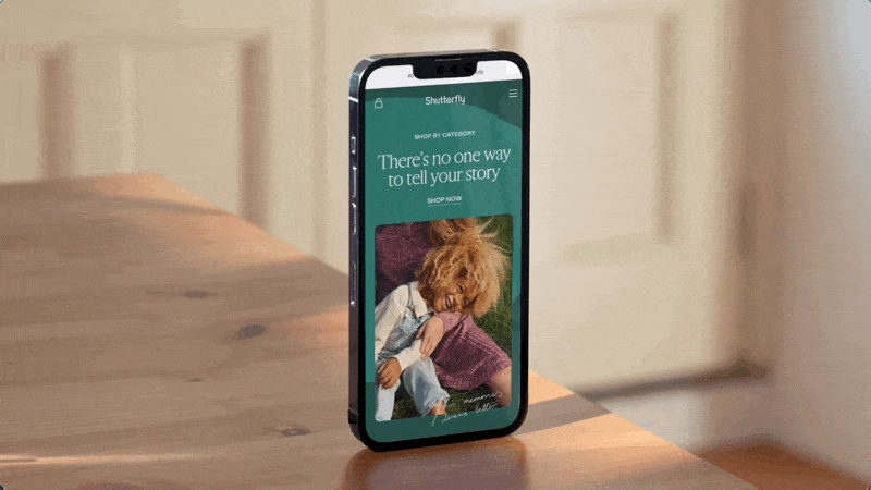
Shutterfly
Shutterfly’s visual system reflects the rich and layered lives of our customers. Line elements and handwriting nod to the personal stories behind what our customers print. Organic shapes cast shadows to ground our identity. Our color palette brings in rich tonal shades, grounding while complementing Shutterfly’s signature orange. We add polish by leading with a serif and surface a sans serif to modernize our overall identity.


Snapfish
Snapfish’s visual system celebrates the snapshots that tell the story of our lives, and acknowledges that moments of all sizes can have big impact. It leverages framing as a means of celebrating every moment, shaping fresh compositions with our simple lifework and scaling images into tiled mosaic. Our flat graphic elements paired with a sans typeface brings out our modern, playful approach and serve as an extension of Snappy’s form. Our use of color is bright and spirited, just like we are.


